# html和css的技巧
# download属性
例如,我们希望点击“下载”链接下载图片而不是浏览,直接增加一个download属性就可以: <a href="large.jpg" download>下载</a>
不仅如此,我们还可以指定下载图片的文件名: <a href="index_logo.gif" download="5332.gif">下载</a>
如果后缀名一样,我们还可以缺省,直接文件名: <a href="index_logo.gif" download="5332">下载</a>
# :not()的应用技巧
我们平时在书写导航栏分割线的时候,最后一个标签是没有分割线的,我们一般的写法如下:
    /* 先给所有添加右侧边框 */
    .nav li {
      border-right: 1px solid #666;
    }
    /* 再去除最后一个边框 */
    .nav li:last-child {
      border-right: none;
    }

    运用:not()之后如下书写:
    .nav li:not(:last-child) {
      border-right: 1px solid #666;
    }
2
3
4
5
6
7
8
9
10
11
12
13
# 纯css制作精美鼠标移上去显示tips效果
看如下案例:
html代码如下:
<div class="haorooms">
     <span data-haorooms="haorooms鼠标效果tips-纯css">haorooms测试</span>
</div>
2
3
css代码如下:
.haorooms{margin-top:30px}

span{
         position: relative;
         display: inline-block;
     }
     span:hover{
         cursor: pointer;
     }
     span:hover:before{
         content: attr(data-haorooms);
         background-color: #2085c5;
 border-radius:3px;
         color: #fff;
         padding: 10px;
         position: absolute;
         left: 100%;
         top: -70%;
         margin-left: 8px;
         white-space: pre;
     }
     span:hover:after{
         content: "";
         position: absolute;
         width: 0;
         height: 0;
         border-right: 8px solid #2085c5;
         border-top: 8px solid transparent;
         border-bottom: 8px solid transparent;
     }
2
3
4
5
6
7
8
9
10
11
12
13
14
15
16
17
18
19
20
21
22
23
24
25
26
27
28
29
30
当然,用纯css写tips,还有其他办法!
# box-shadow的偏移效果来书写移动端导航按钮三道杠
我们可以用box-shadow的偏移效果来书写移动端导航按钮“三道杠”,如下图:

我们正是运用了box-shadow的偏移和连写!何为连写?就是我们可以书写多个box-shadow,并用“,”进行分割。达到不同的效果!
三道杠的代码书写如下:
.sdg {
  width: 45px;
  height: 45px;
  line-height: 2.6;
  border: 1px solid #fff;
}

.sdg::before {
  content: "";
  width: 20px;
  height: 2px;
  background: #fff;
  display: inline-block;
  box-shadow: 0 7px 0 #fff, 0 -7px 0 #fff;
}
2
3
4
5
6
7
8
9
10
11
12
13
14
15
16
上面代码,我们用一个伪元素,书写了中间的一道杠,然后用box - shadow:0 7px 0 #fff,0 -7px 0 #fff;书写了上面和下面的两道杠,分别偏移是7px。
# 隐藏没有静音、自动播放的影片
这是一个自定义用户样式表的不错的技巧。避免在加载页面时自动播放。如果没有静音,则不显示视频:
//code from http://caibaojian.com/css-protips.html
video[autoplay]:not([muted]) {
  display: none;
}
2
3
4
# content
如果您想插入一系列递增的值,比如说“美女1,美女2,美女3,美女4……”,您就可以使用计数器在每个列表项的前面插入递增的序号值。CSS代码如下:
ol {
       list-style-type:none;
       counter-reset:sectioncounter;
    }

    ol li:before {
       content:"美女" counter(sectioncounter) ": ";
       counter-increment:sectioncounter;
    }
2
3
4
5
6
7
8
9
HTML代码如下:
<ol>
    <li><img src="http://image.zhangxinxu.com/image/study/s/s128/mm1.jpg" width="128" height="96" /></li>
    <li><img src="http://image.zhangxinxu.com/image/study/s/s128/mm3.jpg" width="128" height="96" /></li>
</ol>
2
3
4
http://www.zhangxinxu.com/study/201004/css-content-number.html在新窗口打开
# jq选择select的option的title
$("#testid").find("option:selected").attr("title")
# css溢出隐藏
    overflow:hidden;
    text-overflow:ellipsis;
    display:-webkit-box;
    -webkit-box-orient:vertical;
    -webkit-line-clamp:2;
2
3
4
5
# CSS3 linear-gradient线性渐变实现虚线等简单实用图形
# 实现各种需求的虚线border
.dashed {
        height: 1px;
        background: linear-gradient(to right, #000, #000 2px, transparent 2px, transparent);
        background-size: 4px 100%;
    }
2
3
4
5
HTML代码:
<div class="dashed"></div>
实现虚线 通过改变background 线性渐变的大小 和background-size的大小
http://www.zhangxinxu.com/study/201710/css3-linear-gradient-dashed-generate.html在新窗口打开
2 实现微信对话框
.avatar {
   width: 54px; height: 54px;
   border-radius: 50%;
   object-fit: cover;
   float: left;
}
.content {
   margin-left: 70px;
}
.talk {
   display: inline-block;
   max-width: 80%;
   border: 1px solid #ddd;
   border-radius: 3px;
   padding: 6px 10px;
   font-size: 14px;
   background-color: #fff;
   position: relative;
}
.talk::before {
   content: '';
   position: absolute;
   width: 6px; height: 6px;
   background: linear-gradient(to top, #ddd, #ddd) no-repeat, linear-gradient(to right, #ddd, #ddd) no-repeat, linear-gradient(135deg, #fff, #fff 6px, transparent 6px) no-repeat;
   background-size: 6px 1px, 1px 6px, 6px 6px;
   transform: rotate(-45deg);
   left: -4px; top: 13px;
}
2
3
4
5
6
7
8
9
10
11
12
13
14
15
16
17
18
19
20
21
22
23
24
25
26
27
28
HTML代码:
<img src="mm1.jpg" class="avatar">
<div class="content">
    <p class="talk">这是对话内容</p>
</div>
2
3
4
http://www.zhangxinxu.com/study/201710/css3-linear-gradient-triangle.html在新窗口打开
3 实现加号和减号
.btn {
  display: inline-block;
  background: #f0f0f0 no-repeat center;
  border: 1px solid #d0d0d0;
  width: 24px; height: 24px;
  border-radius: 2px;
  box-shadow: 0 1px rgba(100,100,100,.1);
  color: #666;
  transition: color .2s, background-color .2s;
}
.btn:active {
  box-shadow: inset 0 1px rgba(100,100,100,.1);
}
.btn:hover {
  background-color: #e9e9e9;
  color: #333;
}
.btn-plus {
  background-image: linear-gradient(to top, currentColor, currentColor), linear-gradient(to top, currentColor, currentColor);
  background-size: 10px 2px, 2px 10px;
}
.btn-minus {
  background-image: linear-gradient(to top, currentColor, currentColor);
  background-size: 10px 2px;
}
HTML代码:
2
3
4
5
6
7
8
9
10
11
12
13
14
15
16
17
18
19
20
21
22
23
24
25
26
HTML代码:
<a href="javascript:" class="btn btn-plus" role="button" title="增加"></a>
<input value="1" size="1">
<a href="javascript:" class="btn btn-minus" role="button" title="减少"></a>
2
3
http://www.zhangxinxu.com/study/201710/css3-linear-gradient-plus-minus.html在新窗口打开
2.边框渐变 border-image: -webkit-linear-gradient( #b5a76f, #a79c64,#938b5d, #b5a76f) 3.文字渐变
background: -webkit-linear-gradient(left, rgb(194,169,99), rgb(255,243,182) 5%, rgb(194,169,99), rgb(255,243,182) 95%, rgb(194,169,99));
 -webkit-background-clip: text;
 -webkit-text-fill-color: transparent;
2
3
4
5
# CSS3 Patterns Gallery 各种css3纹理背景图
http://lea.verou.me/css3patterns/在新窗口打开
多重边框 ● 利用重复指定box-shadow来达到多个边框的效果
div {
box-shadow: 0 0 0 6px rgba(0, 0, 0, 0.2), 0 0 0 12px rgba(0, 0, 0, 0.2), 0 0 0 18px rgba(0, 0, 0, 0.2), 0 0 0 24px rgba(0, 0, 0, 0.2);
height: 200px;
margin: 50px auto;
width: 400px
}
2
3
4
5
6
实时编辑CSS ● 通过设置style标签的display:block样式可以让页面的style标签显示出来,并且加上contentEditable属性后可以让样式成为可编辑状态,更改后的样式效果也是实时更新呈现的。此技巧在IE下无效。
<style style="display:block" contentEditable>
    body { color: blue }
</style>
2
3
HTML
<base target="_blank" />
# HTML DOM classList 属性
document.getElementById("myDIV").classList.add("mystyle");
# 语法
_element_
`.classList`
# Properties
| 属性 | Description |
|---|---|
| length | 返回类列表中类的数量该属性是只读的 |
# 方法
| 方法 | 描述 |
|---|---|
| add(class1, class2, ...) | 在元素中添加一个或多个类名。如果指定的类名已存在,则不会添加 |
| contains(class) | 返回布尔值,判断指定的类名是否存在。可能值:true - 元素包已经包含了该类名false - 元素中不存在该类名 |
| item(index) | 返回类名在元素中的索引值。索引值从 0 开始。如果索引值在区间范围外则返回 null |
| remove(class1, class2, ...) | 移除元素中一个或多个类名。注意: 移除不存在的类名,不会报错。 |
| toggle(class, true | false) |
# 可以输入也可以下拉选择的select
jQuery Editable Select项目官网地址:
https://github.com/indrimuska/jquery-editable-select在新窗口打开
# HTML结构
下面是一个基本的select下拉框。
<select id="editable-select">
    <option>Alfa Romeo</option>
    <option>Audi</option>
    <option>中国人民银行</option>
    <option>中国人民</option>
    <option>中国</option>
    <option>BMW</option>
</select>
2
3
4
5
6
7
8
此外还需要加载jQuery库和`jquery.editable-select.js`文件,在源码下载包里已经有了。
# jQuery
只需要以下代码就能实现传统的下拉框变成有输入功能的下拉框了。
$('#editable-select').editableSelect({
    effects: 'slide'
});
2
3
其实我们细看插件代码就会发现,作者是将原有的select处理了下,变成了一个输入表单text和一个列表ul。这样text可以输入,下拉选项则用ul面板,这样一来ul里的选项就可以添加任意html代码了,demo中有示例。然后通过使用CSS以及js技术可以实现下拉弹出、输入查找匹配功能。
# 选项设置
- filter:过滤,即当输入内容时下拉选项会匹配输入的字符,支持中文,true/false,默认true。
- effects:动画效果,当触发弹出下拉选择框时的下拉框展示过渡效果,有default,slide,fade三个值,默认是default。
- duration:下拉选项框展示的过渡动画速度,有fast,slow,以及数字(毫秒),默认是fast。
# 事件
- onCreate:当输入时触发。
- onShow:当下拉时触发。
- onHide:当下拉框隐藏时触发。
- onSelect:当下拉框中的选项被选中时触发。
事件调用方法:
$('#editable-select').editableSelect({
    onSelect: function (element) {
        alert("Selected!");
    }
});
2
3
4
5
此外,还支持键盘方向键、回车键、Tab键以及Esc键操作。
# css loading效果
/* 按钮loading */
a[class*=-btn].loading,
label[class*=-btn].loading {
    position: relative;
}
a[class*=-btn].loading::first-line,
label[class*=-btn].loading::first-line {
    color: transparent;
}
a[class*=-btn].loading::before,
label[class*=-btn].loading::before {
    width: 4px; height: 4px;
    margin: auto;
    content: '';
    -webkit-animation: spinZoom 1s steps(8) infinite;
    animation: spinZoom 1s steps(8) infinite;
    border-radius: 100%;
    box-shadow: 0 -10px 0 1px currentColor, 10px 0 currentColor, 0 10px currentColor, -10px 0 currentColor, -7px -7px 0 .5px currentColor, 7px -7px 0 1.5px currentColor, 7px 7px currentColor, -7px 7px currentColor;
    /* center */
    position: absolute;
    top: 0; right: 0; bottom: 0; left: 0;
}
/* loading动画 */
@-webkit-keyframes spinZoom {
    0% {
        -webkit-transform: scale(.75) rotate(0);
    }
    100% {
        -webkit-transform: scale(.75) rotate(360deg);
    }
}
@keyframes spinZoom {
    0% {
        transform: scale(.75) rotate(0);
    }
    100% {
        transform: scale(.75) rotate(360deg);
    }
}
2
3
4
5
6
7
8
9
10
11
12
13
14
15
16
17
18
19
20
21
22
23
24
25
26
27
28
29
30
31
32
33
34
35
36
37
38
39
# dom元素获得left值
getBoundingClientRect的用法在新窗口打开
getBoundingClientRect用于获取某个元素相对于视窗的位置集合。集合中有top, right, bottom, left等属性。
1.语法:这个方法没有参数。 rectObject = object.getBoundingClientRect();
2.返回值类型:TextRectangle对象,每个矩形具有四个整数性质( 上, 右 , 下,和左 )表示的坐标的矩形,以像素为单位。
- rectObject.top:元素上边到视窗上边的距离;
- rectObject.right:元素右边到视窗左边的距离;
- rectObject.bottom:元素下边到视窗上边的距离;
- rectObject.left:元素左边到视窗左边的距离;
示图:
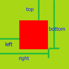
- 兼容性:我用ie11的Document Mode模式测试,ie5以上都能支持。
# 滚动条样式
/*滚动条样式*/
.pro-wrapper::-webkit-scrollbar {/*滚动条整体样式*/
    width: 6px;     /*高宽分别对应横竖滚动条的尺寸*/
}
.pro-wrapper::-webkit-scrollbar-thumb {/*滚动条里面小方块*/
    background: #29a9df;
}
.pro-wrapper::-webkit-scrollbar-track {/*滚动条里面轨道*/
    background: #e6e6e6;
}
2
3
4
5
6
7
8
9
10
/*隐藏滚动条*/
::-webkit-scrollbar {
        display:none
      }
2
3
4
# 当页面有position:fixed的置顶悬浮菜单时,如何调整锚定位的时候不被悬浮菜单挡住?
function locateAt(e){
    e =  document.getElementById(e);/*以id命名的锚点*/
    y = e.offsetTop;
    while(e=e.offsetParent){ y  = e.offsetTop;}
    y-=65;/*悬浮菜单的高度*/
    window.scrollTo(0,y);
}
2
3
4
5
6
7
原来的:
<a href="#target">锚点定位</a><a href="javascript:void(0)" onclick="locateAt('target')">锚点定位</a>
# input,option,canvas
1. input:focus

input:valid

input:focus:invalid

::-webkit-input-placeholder

2. province.add(new Option(arr[i].name,arr[i].name),null);

area.options.length=1;

city.options.length=1;

3.ctx.translate()

ctx.rotate()

Math.PI;

ctx=canvas.getContext("2d");

ctx.save();

ctx.restore();

ctx.arc(0,0,200,0,360);

ctx.rect(x,y,width,height);

ctx.font;ctx.textAlign;ctx.textBaseline;

var grd=ctx.createLinearGradient(0,-100,0,100);

grd.addColorStop(0,"black");

grd.addColorStop(1,"white");

ctx.fillStyle=grd;

ctx.fillRect(20,20,150,100);

clearRect(0,0,canvas.width,canvas.height);

ctx.moveTo(x,y);

ctx.lineWidth;

ctx.strokeStyle;

ctx.lineCap="round"

ctx.lineTo;

ctx.stroke();
2
3
4
5
6
7
8
9
10
11
12
13
14
15
16
17
18
19
20
21
22
23
24
25
26
27
28
29
30
31
32
33
34
35
36
37
38
39
40
41
42
43
44
45
46
47
48
49
50
51
52
53
54
55
# 使用JS判断用户操作系统是否安装某字体
http://www.zhangxinxu.com/wordpress/2018/02/js-detect-suppot-font-family/在新窗口打开
下午突发灵感,写了一段JavaScript小脚本,可以用来判断用户的操作系统是否安装了某字体,代码如下:
var isSupportFontFamily = function (f) {
  if (typeof f != "string") {
    return false
  }
  var h = "Arial";
  if (f.toLowerCase() == h.toLowerCase()) {
    return true
  }
  var e = "a";
  var d = 100;
  var a = 100, i = 100;
  var c = document.createElement("canvas");
  var b = c.getContext("2d");
  c.width = a;
  c.height = i;
  b.textAlign = "center";
  b.fillStyle = "black";
  b.textBaseline = "middle";
  var g = function (j) {
    b.clearRect(0, 0, a, i);
    b.font = d   "px "   j   ", "   h;
    b.fillText(e, a / 2, i / 2);
    var k = b.getImageData(0, 0, a, i).data;
    return [].slice.call(k).filter(function (l) {
      return l != 0
    })
  };
  return g(h).join("") !== g(f).join("")
};
2
3
4
5
6
7
8
9
10
11
12
13
14
15
16
17
18
19
20
21
22
23
24
25
26
27
28
29
# 语法
isSupportFontFamily(fontFamily);
其中fontFamily参数是必须的,为CSS中font-family设置的web可识别的字体名称,例如宋体'simsun',微软雅黑'Microsoft Yahei'等。
例如,我们要判断用户的操作系统是否安装了微软雅黑字体,可以这么处理:
// isSupportMicrosoftYahei为true或者false
var isSupportMicrosoftYahei = isSupportFontFamily('Microsoft Yahei');
2
如果用户的操作系统安装了微软雅黑,则isSupportMicrosoftYahei为true,否则为false。
# 后台验证码为文件(流)
      var xmlhttp;
xmlhttp=new XMLHttpRequest();
xmlhttp.open("GET","https://pet.sonystyle.com.cn:9002/eSolverOmniChannel/account/displayCaptcha.do",true);
xmlhttp.responseType = "blob";
xmlhttp.onload = function(){
   if (this.status == 200) {
      var blob = this.response;
      var img = document.getElementById("img");
      window.URL.revokeObjectURL(img.src);//ie10
      img.src = window.URL.createObjectURL(blob);
      console.log(img.src)
      console.log(xmlhttp.getResponseHeader("captchaKey"));
   }
}
xmlhttp.send();
2
3
4
5
6
7
8
9
10
11
12
13
14
15
# ajax进度条
https://www.w3.org/TR/progress-events/在新窗口打开
https://github.com/axios/axios在新窗口打开
var client = new XMLHttpRequest()
client.open('POST', _api.HybrisAPI.masterData(this.access_token))
client.onprogress = function (pe) {
    if (pe.lengthComputable) {
        console.log((pe.loaded/pe.total*100).toFixed(2) '%完成')
        /*progressBar.max = pe.total
        progressBar.value = pe.loaded*/
    }
}
client.onloadend = function (pe) {
    console.log('master加载完成')
    // progressBar.value = pe.loaded
}
client.onreadystatechange=function () {
    if((client.readyState===4)){
        if(client.status===200){
            console.log(JSON.parse(client.responseText));
            resolve(JSON.parse(client.responseText))
        }
    }
}
client.send();

axios({
    method:'post',
    url:apiShopCar '/eSolverOmniChannel/masterData/cityMaster.do?access_token=' localStorage.access_token,
    responseType:'json',
    onDownloadProgress: function (progressEvent) {
        // Do whatever you want with the native progress event
        console.log((progressEvent.loaded)/(progressEvent.total))
    },
})
    .then(function(response) {
        console.log(response.data)
    });
2
3
4
5
6
7
8
9
10
11
12
13
14
15
16
17
18
19
20
21
22
23
24
25
26
27
28
29
30
31
32
33
34
35
# textarea的placeholder如何换行?
textarea::-webkit-input-placeholder:after{
  display:block;
  content:"line@ A line#";/*  A 表示换行  */
  color:red;
};
2
3
4
5
# writing-mode属性
实现垂直方向的排版
css3:
writing-mode:horizontal-tb;//默认:水平方向,从上到下writing-mode: vertical-rl;//垂直方向,从右向左writing-mode: vertical-lr;//垂直方向,从左向右
# webkit-playsinline
手机video 都可以在页面中播放,而不是全屏播放了。
<video src="test.mp4" webkit-playsinline="true"></video>
# 如何去掉 chrome input 的背景黄色
input:-webkit-autofill {
  -webkit-box-shadow: 0 0 0px 1000px rgba(255, 255, 255, 1) inset !important;
}
2
3
# 打印技巧
打印自动分页
@media print {
.item {
      page-break-after: always;
    }
}
2
3
4
5
# cursor
zoom-in | zoom-out 放大缩小 grab | grabbing 手型抓取
# CSS3 greyscale 滤镜实现
图片转为黑白,每逢大的灾难的时候,很多网站变成了灰色
.gray {
    -webkit-filter: grayscale(100%);
    -moz-filter: grayscale(100%);
    -ms-filter: grayscale(100%);
    -o-filter: grayscale(100%);

    filter: grayscale(100%);  //chrome18+

    filter: gray;
}
2
3
4
5
6
7
8
9
10
# CSS3 blur滤镜实现 图片模糊化
.blur {
    -webkit-filter: blur(10px); /* Chrome, Opera */
       -moz-filter: blur(10px);
        -ms-filter: blur(10px);
            filter: blur(10px);
}
2
3
4
5
6
# 优化显示文本
有时,字体并不能在所有设备上都达到最佳的显示,所以可以让设备浏览器来帮助你:·
//code from http://caibaojian.com/useful-css-tips.html
html {
  -moz-osx-font-smoothing: grayscale;
  -webkit-font-smoothing: antialiased;
  text-rendering: optimizeLegibility;
}
2
3
4
5
# 使用属性选择器用于空链接
当a元素没有文本值,但 href 属性有链接的时候显示链接:·
//code from http://caibaojian.com/useful-css-tips.html
a[href^="http"]:empty::before {
  content: attr(href);
}
2
3
4
相当方便。
# 给input的placeholder设置颜色
::-webkit-input-placeholder { /* WebKit browsers */
    color:    #999;
}
:-moz-placeholder { /* Mozilla Firefox 4 to 18 */
    color:    #999;
}
::-moz-placeholder { /* Mozilla Firefox 19+ */
    color:    #999;
}
:-ms-input-placeholder { /* Internet Explorer 10+ */
    color:    #999;
}
2
3
4
5
6
7
8
9
10
11
12
# DIV可编辑
就是让一个div变成一个类似input输入框的效果。
<div id="div1" contentEditable="true"  ></div>
<div contenteditable="plaintext-only" placeholder="请输入内容"></div>
2
# CSS3 Filter的十种特效
# 使用纯css实现波浪效果
有时候我们需要实现水晃动的效果,其实我们可以通过 css 旋转动画和圆角来实现。
首先来2个div,外层div相对定位,内层div绝对定位,内层div大致位于外层div上半部分。外层div设置一个颜色较深的背景色(水的颜色);内层div颜色设置为白色,加上圆角,圆角建议30%-45%之间,然后加上无限循环的旋转动画,通过内层div的旋转来实现波浪效果。
参考代码如下:
# 移动端1px边框解决方案
div:after {
            content: '';
            position: absolute;
            top: 0;
            left: 0;
            width: 200%;
            height: 200%;
            transform: scale(0.5);
            transform-origin: left top;
            box-sizing: border-box;
            z-index: 990;
            border: 1px solid #e5e5e5;
        }
2
3
4
5
6
7
8
9
10
11
12
13
- https://juejin.im/post/5d8470e1518825554673e1c0
# CSS实现文字两端对齐
li span{
    display: inline-block;
    width: 60px;
    text-align: justify;
    vertical-align: top;
    height: 20px;
    &::after {
      content: "";
      display: inline-block;
      width: 100%;
    }
  }
2
3
4
5
6
7
8
9
10
11
12
# 今日图 - 扎心了,老铁